Installs into .claude/skills of the current project.
Are you the author of Iblai Vibe Account?
Add the live security badge to your README. It updates with every re-scan.
[](https://www.skillsdirectory.com/skills/iblai-iblai-vibe-account)
---
name: iblai-vibe-account
description: Add account and organization settings page to your Next.js app
globs:
alwaysApply: false
metadata:
kind: ui
---
# /iblai-vibe-account
> **First time here?** If `iblai.env` has no `ARCHITECTURE=`, run `/iblai-vibe-start` first (four questions; two minutes) — it decides single-org / multi-org / headless and who signs in, and every skill reads the answer.
Add an account/organization settings page with tabs for Organization info,
User Management, Integrations, Advanced settings, and Billing.
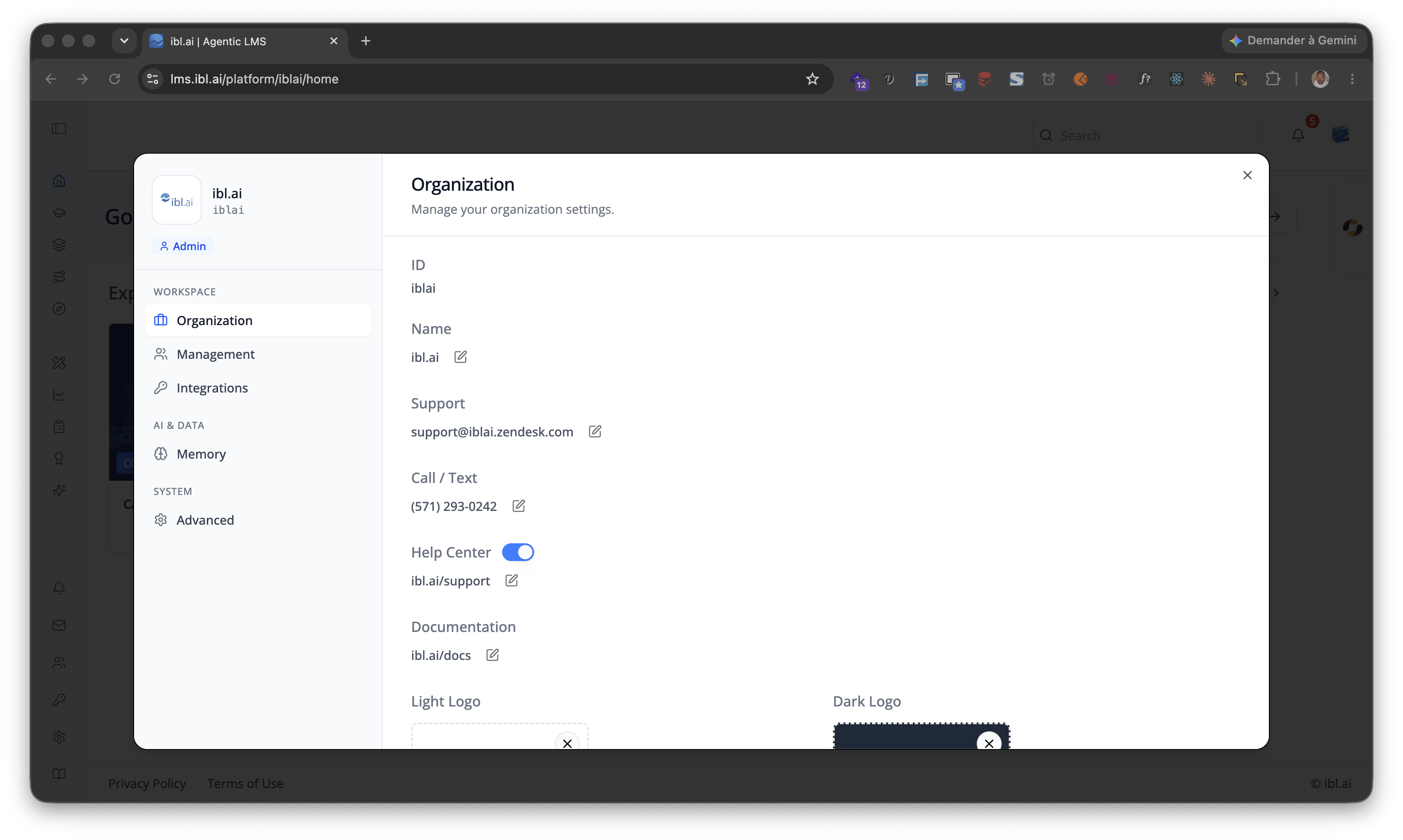
> **Template:** the page this skill creates is bundled as
> [`assets/account-page.tsx.j2`](assets/account-page.tsx.j2). See
> [`/iblai-vibe-scaffold`](../../start/iblai-vibe-scaffold/SKILL.md) for the `{{ }}` contract.
> **Navbar:** If the user wants a navbar with links to the account page,
> guide them to `/iblai-vibe-navbar` first. That skill creates the full navbar
> with logo, page links, notification bell, and profile dropdown.
> **Common setup (brand, conventions, env files, verification):** see [docs/skill-setup.md](https://raw.githubusercontent.com/iblai/vibe/refs/heads/main/docs/skill-setup.md).
## Step 0: Start from vibe-starter? (new projects)
Before running this skill, ask the user:
> Are you starting a new project from scratch? vibe-starter
> (https://github.com/iblai/vibe/tree/main/skills/start/iblai-vibe-ops-init/assets/vibe-starter) already ships the /account
> page wired up, alongside auth, navbar, and profile/notifications. Want to
> use that instead?
If yes, copy the bundled starter template from the installed
`iblai-vibe-ops-init` skill's `assets/vibe-starter/` directory (it sits
alongside this skill in your skills directory; in the vibe repo it lives
under `skills/start/`), or fetch it from the vibe repo if those assets
are not installed -- tell the user which path you took -- then skip this
skill:
cp -a <skills-dir>/iblai-vibe-ops-init/assets/vibe-starter/. .
# or, without local assets:
git clone --depth 1 https://github.com/iblai/vibe.git vibe-tmp && cp -a vibe-tmp/skills/start/iblai-vibe-ops-init/assets/vibe-starter/. . && rm -rf vibe-tmp
pnpm install --ignore-scripts
> Run with `--ignore-scripts` to skip package lifecycle (postinstall) scripts.
If they prefer to add the account page to an existing app, continue below.
## Prerequisites
- Auth must be set up first (`/iblai-vibe-auth`)
- MCP server + skills configured (`@iblai/mcp` in `.mcp.json`)
## Step 1: Check Environment
Before proceeding, check for a `iblai.env`
in the project root. Look for `PLATFORM`, `DOMAIN`, and `TOKEN` variables.
If the file does not exist or is missing these variables, tell the user:
"You need an `iblai.env` with your platform configuration. Download the
template and fill in your values:
`curl -o iblai.env https://raw.githubusercontent.com/iblai/vibe/refs/heads/main/iblai.env`"
## Step 2: Create the Page
Render [`assets/account-page.tsx.j2`](assets/account-page.tsx.j2) into
`app/(app)/account/page.tsx` (substitute `{{ }}` placeholders), or just use
the reference implementation in Step 3.
## Files created
| File | Purpose |
|------|---------|
| `app/(app)/account/page.tsx` | Account/organization settings page with tabs |
The page reads `userData`, `tenant`/`current_tenant`, and `tenants` from
localStorage. Admin status is derived from the `tenants` array.
> **Note:** The `Account` component uses `next/image` internally -- it is
> imported from `@iblai/iblai-js/web-containers/next`.
## Step 3: Wrap in a White Container
The SDK Account component has no outer background. Wrap it in a white
container so it renders as a card against the gray page background
(`--sidebar-bg: #fafbfc`).
### Reference implementation
```tsx
// app/(app)/account/page.tsx
"use client";
import { useEffect, useState } from "react";
import { useRouter } from "next/navigation";
import { Account } from "@iblai/iblai-js/web-containers/next";
import config from "@/lib/iblai/config";
import { resolveAppTenant } from "@/lib/iblai/tenant";
export default function AccountPage() {
const router = useRouter();
const [username, setUsername] = useState("");
const [email, setEmail] = useState("");
const [tenantKey, setTenantKey] = useState("");
const [tenants, setTenants] = useState<any[]>([]);
const [isAdmin, setIsAdmin] = useState(false);
const [ready, setReady] = useState(false);
useEffect(() => {
try {
const raw = localStorage.getItem("userData");
if (raw) {
const parsed = JSON.parse(raw);
setUsername(parsed.user_nicename ?? parsed.username ?? "");
setEmail(parsed.user_email ?? parsed.email ?? "");
}
} catch {}
const resolved = resolveAppTenant();
setTenantKey(resolved);
try {
const tenantsRaw = localStorage.getItem("tenants");
if (tenantsRaw) {
const parsed = JSON.parse(tenantsRaw);
setTenants(parsed);
const match = parsed.find((t: any) => t.key === resolved);
if (match) setIsAdmin(!!match.is_admin);
}
} catch {}
setReady(true);
}, []);
if (!ready || !tenantKey) {
return (
<div className="flex flex-1 items-center justify-center">
<p className="text-sm text-gray-400">Loading account settings...</p>
</div>
);
}
return (
<div className="mx-auto w-full flex-1 overflow-auto px-4 py-8 md:w-[75vw] md:px-0">
<div className="rounded-lg border border-[var(--border-color)] bg-white overflow-hidden">
<Account
tenant={tenantKey}
tenants={tenants}
username={username}
email={email}
mainPlatformKey={config.mainTenantKey()}
isAdmin={isAdmin}
authURL={config.authUrl()}
currentPlatformBaseDomain={config.platformBaseDomain()}
currentSPA="agent"
onInviteClick={() => {}}
onClose={() => router.push("/")}
targetTab="organization"
showPlatformName={true}
useGravatarPicFallback={true}
/>
</div>
</div>
);
}
```
### Key patterns
- **White container wrapper**: Wrap the `Account` component in a
`bg-white rounded-lg border border-[var(--border-color)] overflow-hidden`
div so it renders as a card against the gray page background.
- **Responsive width**: `w-full px-4` on mobile, `md:w-[75vw] md:px-0`
on desktop.
## Step 4: Use MCP Tools for Customization
```
get_component_info("Account")
```
## `<Account>` Props
### Required
| Prop | Type | Description |
|------|------|-------------|
| `tenant` | `string` | Platform key |
| `tenants` | `Tenant[]` | Full list of user platforms from localStorage |
| `username` | `string` | Username |
| `email` | `string` | User email (from `userData` in localStorage) |
| `mainPlatformKey` | `string` | Main org key — `config.mainTenantKey()` |
| `onInviteClick` | `() => void` | Called when "Invite user" is clicked |
| `onClose` | `() => void` | Cancel/close callback |
| `authURL` | `string` | Auth service URL |
| `isAdmin` | `boolean` | Controls tab visibility -- most tabs require `true` |
### Optional
| Prop | Type | Description |
|------|------|-------------|
| `targetTab` | `string` | Initial tab: `organization`, `management`, `integrations`, `advanced`, `billing`, `memory` (the org-wide Memory surface — see `/iblai-vibe-memory`) |
| `currentPlatformBaseDomain` | `string` | Base domain for custom domain settings |
| `currentSPA` | `string` | Current app identifier (e.g., `"agent"`) |
| `billingURL` | `string` | Stripe billing portal URL -- shows Billing tab |
| `topUpURL` | `string` | Stripe top-up URL -- shows Billing tab |
| `enableRbac` | `boolean` | Turn on RBAC permission checks for Management. **Only ever pass this together with `rbacPermissions`** — see the warning below |
| `rbacPermissions` | `object` | The caller's effective permissions, from `POST /dm/api/core/rbac/permissions/check/`. Defaults to `{}` |
| `onLoadGroupPermissions` | `(permissions: object) => void` | Optional; the Teams tab calls it with group-scoped permissions so you can merge them back in |
| `showPlatformName` | `boolean` | Show platform name badge in sidebar |
| `useGravatarPicFallback` | `boolean` | Use Gravatar when no org logo |
> **`enableRbac` without `rbacPermissions` hides Management entirely.**
> `checkRbacPermission(perms, resource, enableRbac)` returns `true` when RBAC is
> **off**, but denies everything when it is **on** and the permissions object is
> empty — so passing the flag alone is strictly worse than omitting it, and the
> Management tab disappears even for an org admin. Either pass both (load them
> with `POST rbac/permissions/check/`, see `/iblai-vibe-rbac`) or pass neither.
> Single-org apps whose admin routes are already admin-gated should pass
> neither: vibe-starter and the ibl.ai OS's own admin dialog both do.
## Tabs
| Tab | Requires |
|-----|---------|
| **Organization** | `isAdmin === true` |
| **Management** | `enableRbac` unset (any admin), or `enableRbac` **plus** a `rbacPermissions` object granting one of `/platforms/<org>/#can_manage_users`, `/groups/#list`, `/roles/#list`, `/policies/#list`, `/usergroups/#list`, `/watchedgroups/#list` |
| **Integrations** | `isAdmin === true` |
| **Advanced** | `isAdmin === true` |
| **Billing** | `billingURL` or `topUpURL` prop set |
## Step 5: Verify
Run `/iblai-vibe-ops-test` before telling the user the work is ready:
1. `pnpm build` -- must pass with zero errors
2. `pnpm test` -- vitest must pass
3. Start dev server and touch test:
```bash
pnpm dev &
npx playwright screenshot http://localhost:3000/account /tmp/account.png
```
## Important Notes
- **Next.js required**: Import from `@iblai/iblai-js/web-containers/next` (uses `next/image`)
- **Redux store**: Must include `mentorReducer` and `mentorMiddleware`
- **`initializeDataLayer()`**: 5 args (v1.2+)
- **`@reduxjs/toolkit`**: Deduplicated via webpack aliases in `next.config.ts`
- **`currentPlatformBaseDomain`**: Must be `{config.platformBaseDomain()}` — uses the config helper, not a raw env var. This is correct and intentional.
- **SDK hardcoded styles**: The SDK Account component uses `bg-white` and
`bg-gray-50` internally. Do NOT override these. Instead, wrap the component
in a white container so it renders correctly against the gray page background.
- **Brand guidelines**: [BRAND.md](https://raw.githubusercontent.com/iblai/vibe/refs/heads/main/BRAND.md)



