Back to skills
SKILL.md
Iblai Vibe Workflow
BSecurityAdd workflow builder components to your Next.js app
- 15 stars
- 0 votes
- 0 copies
- 2 views
- Added September 2, 2026
Works with
Security analysis
75/100- Exfiltrates credentials via HTTP — exact pattern from Snyk ToxicSkills study
npx -y skills add iblai/vibe --skill iblai-vibe-workflow --agent claude-codeAre you the author of Iblai Vibe Workflow?
Add the live security badge to your README. It updates with every re-scan.
[](https://www.skillsdirectory.com/skills/iblai-iblai-vibe-workflow)---
name: iblai-vibe-workflow
description: Add workflow builder components to your Next.js app
globs:
alwaysApply: false
metadata:
kind: ui
---
# /iblai-vibe-workflow
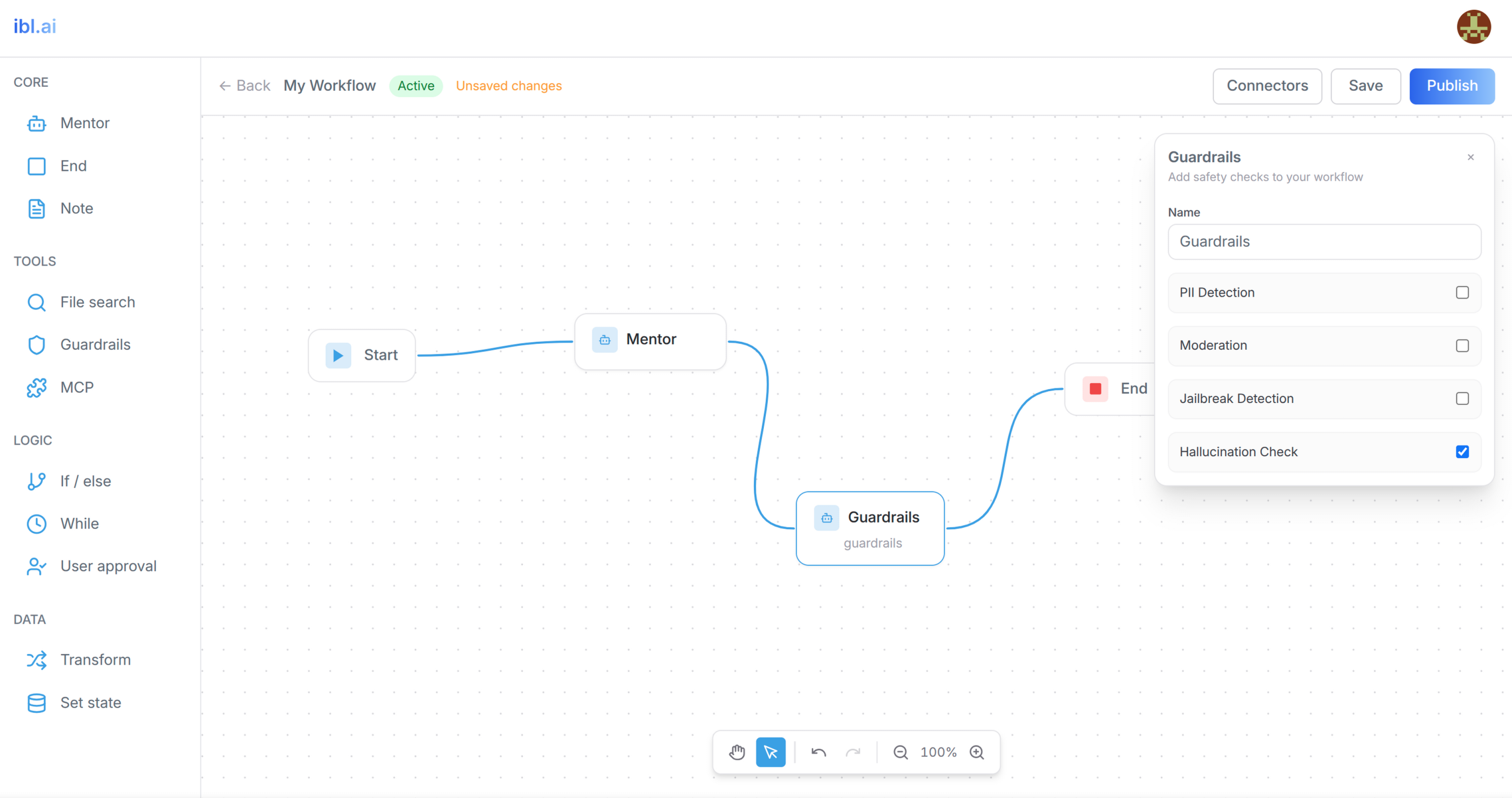
Add AI workflow builder features -- a visual workflow editor with a node type
browser sidebar, node configuration panels, connector management, and
create/delete workflow modals. Includes a custom canvas with drag-and-drop,
bezier curve edges, pan/zoom, undo/redo, and auto-save.
> **Common setup (brand, conventions, env files, verification):** see [docs/skill-setup.md](https://raw.githubusercontent.com/iblai/vibe/refs/heads/main/docs/skill-setup.md).
## Prerequisites
- Auth must be set up first (`/iblai-vibe-auth`)
- MCP server + skills configured (`@iblai/mcp` in `.mcp.json`)
## Step 1: Check Environment
Before proceeding, check for a `iblai.env`
in the project root. Look for `PLATFORM`, `DOMAIN`, and `TOKEN` variables.
If the file does not exist or is missing these variables, tell the user:
"You need an `iblai.env` with your platform configuration. Download the
template and fill in your values:
`curl -o iblai.env https://raw.githubusercontent.com/iblai/vibe/refs/heads/main/iblai.env`"
## Architecture
The workflow feature has two pages and three custom components:
```
app/(app)/workflows/
├── page.tsx # List page (grid of workflows)
└── [id]/page.tsx # Editor page (sidebar + canvas)
components/workflows/
├── types.ts # Shared types (CanvasNode, CanvasEdge, NodeConfig)
├── workflow-canvas.tsx # Custom canvas with SVG edges, pan/zoom, undo/redo
└── node-config-panel.tsx # Context-aware node property editor
```
## Step 2: SDK Components
Import SDK components directly -- there is no CLI generator:
```typescript
// UI components
import {
WorkflowSidebar,
ConnectorManagementDialog,
CreateWorkflowModal,
DeleteWorkflowModal,
} from "@iblai/iblai-js/web-containers";
// RTK Query hooks
import {
useGetWorkflowsQuery,
useGetWorkflowQuery,
useCreateWorkflowMutation,
useDeleteWorkflowMutation,
usePatchWorkflowMutation,
usePublishWorkflowMutation,
useValidateWorkflowMutation,
workflowsApiSlice,
} from "@iblai/iblai-js/data-layer";
```
## Step 3: Register workflowsApiSlice in Redux Store
**CRITICAL**: Add `workflowsApiSlice` to the store in `store/iblai-store.ts`:
```typescript
import {
coreApiSlice,
mentorReducer,
mentorMiddleware,
workflowsApiSlice,
} from "@iblai/iblai-js/data-layer";
export const store = configureStore({
reducer: {
[coreApiSlice.reducerPath]: coreApiSlice.reducer,
[workflowsApiSlice.reducerPath]: workflowsApiSlice.reducer,
mentor: mentorReducer,
},
middleware: (getDefaultMiddleware) =>
getDefaultMiddleware()
.concat(coreApiSlice.middleware)
.concat(workflowsApiSlice.middleware)
.concat(mentorMiddleware),
});
```
Without this, all workflow API hooks will silently return `undefined`.
## SDK Component Props (VERIFIED)
> **IMPORTANT**: The prop names below are the ACTUAL props accepted by
> the SDK. The skill docs in older versions had incorrect prop names.
> Do NOT use `isOpen`, `onClose`, `org`, or `onCreate` -- they will fail.
### `<WorkflowSidebar>`
Node type browser sidebar. Does NOT accept `org` or `tenant`.
| Prop | Type | Description |
|------|------|-------------|
| `onDragStart` | `(item: {id, label, type}) => void` | Called when user starts dragging a node type |
| `onItemClick` | `(item: {id, label, type}) => void` | Called when user clicks a node type |
### `<ConnectorManagementDialog>`
| Prop | Type | Description |
|------|------|-------------|
| `open` | `boolean` | Whether the dialog is visible |
| `onClose` | `() => void` | Close callback |
Note: Uses `open` (NOT `isOpen`). Does NOT accept `org`.
### `<CreateWorkflowModal>`
| Prop | Type | Description |
|------|------|-------------|
| `open` | `boolean` | Whether the modal is visible |
| `onOpenChange` | `(open: boolean) => void` | Open state setter |
| `onCreateWorkflow` | `(name: string) => void` | Callback with workflow name |
| `isCreating` | `boolean` | Loading state |
**WARNING**: Does NOT use `isOpen`/`onClose`/`onCreate`. Those are wrong.
### `<DeleteWorkflowModal>`
| Prop | Type | Description |
|------|------|-------------|
| `isOpen` | `boolean` | Whether the modal is visible |
| `onClose` | `() => void` | Close callback |
| `onConfirm` | `() => void` | Confirm deletion callback |
| `isDeleting` | `boolean` | Loading state |
| `workflowName` | `string` | Name displayed in confirmation |
**WARNING**: Does NOT use `workflowId` or `onDelete`. Those are wrong.
## Step 4: Create the Types File
Create `components/workflows/types.ts` with the shared data model.
Node data is **nested** in `node.data` (not flat on the node):
```typescript
// Workflow canvas types — matching mentorai's data model
export interface Variable {
id: string;
name: string;
type: string;
defaultValue?: string;
}
export interface Condition {
id: string;
caseName: string;
expression: string;
}
export interface TransformExpression {
id: string;
key: string;
value: string;
}
export interface SetStateAssignment {
id: string;
variable: string;
value: string;
}
export interface NodeConfig {
label: string;
subtitle?: string;
color?: string;
content?: string;
// Start node
stateVariables?: Variable[];
// Mentor node
entry_mentor_id?: string;
mentor_id?: string;
instructions?: string;
model?: string;
// Conditional
conditionCount?: number;
conditions?: Condition[];
// While
whileExpression?: string;
// User-approval
userApprovalMessage?: string;
// Transform
transformMode?: "expressions" | "object";
transformExpressions?: TransformExpression[];
// Set-state
setStateAssignments?: SetStateAssignment[];
// End
output?: string;
// File-search
datasetId?: string;
datasetName?: string;
maxResults?: number;
fileSearchQuery?: string;
// Shared
continueOnError?: boolean;
// MCP
mcpConnectors?: { id: string; name: string; icon?: string }[];
}
export interface CanvasNode {
id: string;
type: string;
position: { x: number; y: number };
data: NodeConfig;
width?: number;
height?: number;
selected?: boolean;
dragging?: boolean;
draggable?: boolean;
selectable?: boolean;
connectable?: boolean;
}
export interface CanvasEdge {
id: string;
source: string;
target: string;
sourceHandle?: string;
targetHandle?: string;
}
```
## Step 5: Create the Workflow List Page
`app/(app)/workflows/page.tsx` -- shows all workflows in a grid.
Key patterns:
- Uses `useGetWorkflowsQuery({ org: tenant, params: search ? { search } : undefined })`
- Workflow response has `results` array with `unique_id`, `name`, `is_active`, `description`, `updated_at`
- Create: passes `{ name, definition: { nodes: DEFAULT_NODES, edges: DEFAULT_EDGES } }`
- Delete: passes `{ org: tenant, uniqueId: deleteTarget.id }`
- Navigates to `/workflows/${result.unique_id}` after create
Default nodes for new workflows:
```typescript
const DEFAULT_NODES = [
{
id: "start",
type: "start",
position: { x: 300, y: 250 },
data: { label: "Start" },
},
{
id: "mentor-1",
type: "mentor",
position: { x: 550, y: 250 },
data: { label: "My mentor", subtitle: "Mentor" },
},
];
const DEFAULT_EDGES = [
{
id: "e-start-mentor-1",
source: "start",
target: "mentor-1",
sourceHandle: "right",
targetHandle: "left",
},
];
```
## Step 6: Create the Workflow Editor Page
`app/(app)/workflows/[id]/page.tsx` -- loads a workflow and renders
the sidebar + canvas with save/publish controls.
Key patterns:
- Uses `useGetWorkflowQuery({ org: tenant, uniqueId: workflowId })`
- Save: `usePatchWorkflowMutation` with `{ org, uniqueId, data: { definition: { nodes, edges } } }`
- Publish: save first, then `useValidateWorkflowMutation`, then `usePublishWorkflowMutation`
- Validation response: `{ errors: string[], warnings: string[] }`
- Cast `workflow.definition?.nodes as CanvasNode[]` (API types them as `unknown[]`)
### Auto-save pattern
Use a 2-second debounced auto-save:
```typescript
const autoSaveTimerRef = useRef<ReturnType<typeof setTimeout> | null>(null);
const isSavingRef = useRef(false);
const doSave = useCallback(async () => {
if (isSavingRef.current) return;
const { nodes, edges } = currentStateRef.current;
const current = JSON.stringify({ nodes, edges });
if (current === initialDataRef.current) return;
isSavingRef.current = true;
try {
await patchWorkflow({ org: tenant, uniqueId: workflowId, data: { definition: { nodes, edges } } }).unwrap();
initialDataRef.current = current;
setHasUnsavedChanges(false);
setSaveMessage("Saved");
setTimeout(() => setSaveMessage(null), 2000);
} catch {
setSaveMessage("Save failed");
setTimeout(() => setSaveMessage(null), 3000);
} finally {
isSavingRef.current = false;
}
}, [patchWorkflow, tenant, workflowId]);
const scheduleAutoSave = useCallback(() => {
if (autoSaveTimerRef.current) clearTimeout(autoSaveTimerRef.current);
autoSaveTimerRef.current = setTimeout(() => doSave(), 2000);
}, [doSave]);
const handleStateChange = useCallback((nodes, edges) => {
currentStateRef.current = { nodes, edges };
if (initialDataRef.current) {
const changed = JSON.stringify({ nodes, edges }) !== initialDataRef.current;
setHasUnsavedChanges(changed);
if (changed) scheduleAutoSave();
}
}, [scheduleAutoSave]);
```
Manual save should cancel any pending auto-save timer:
```typescript
const handleSave = async () => {
if (autoSaveTimerRef.current) clearTimeout(autoSaveTimerRef.current);
await doSave();
};
```
Clean up the timer on unmount:
```typescript
useEffect(() => {
return () => {
if (autoSaveTimerRef.current) clearTimeout(autoSaveTimerRef.current);
};
}, []);
```
## Steps 7–8: Canvas component and node config panel
The full implementations (React Flow canvas with its critical details, `WorkflowCanvas` props, the node config panel with event-propagation and `isLocalUpdate` sync patterns, per-node-type panels, `handleUpdateNode`) are in [`references/canvas-and-node-panel.md`](references/canvas-and-node-panel.md). Copy them as written.
## Step 9: Verify
Run `/iblai-vibe-ops-test` before telling the user the work is ready:
1. `pnpm build` -- must pass with zero errors
2. Start dev server and verify the workflow pages render:
```bash
pnpm dev &
npx playwright screenshot http://localhost:3000/workflows /tmp/workflows.png
```
## Common Pitfalls
1. **Wrong SDK prop names**: The skill docs previously listed incorrect props.
`CreateWorkflowModal` uses `open`/`onOpenChange`/`onCreateWorkflow` (NOT `isOpen`/`onClose`/`onCreate`).
`ConnectorManagementDialog` uses `open` (NOT `isOpen`). Neither takes `org`.
`WorkflowSidebar` uses `onDragStart`/`onItemClick` (NOT `org`).
2. **Edge line gap**: If edges don't connect flush to handle dots, check that
`HANDLE_OFFSET` equals the handle dot's center offset from the node edge
(typically 2, not 8). Also ensure ALL node types have `ref={nodeRef(node.id)}`
on their outermost div so dimensions are measured correctly.
3. **"Cannot read properties of null"**: When dropping from sidebar, read
`e.dataTransfer.getData()` instead of a ref. The ref may not be set.
4. **TypeScript `e.button` narrowing**: Handle middle-click before the
`!== 0` guard to avoid type narrowing issues.
5. **Node data model**: Data must be nested in `node.data` (NodeConfig),
not flat on the node. The API returns `{ id, type, position, data: {...} }`.
6. **workflowsApiSlice not in store**: All workflow hooks return `undefined`
if the slice isn't registered. Add both reducer and middleware.
7. **Config panel closes on click**: The `panelShell` div MUST have both
`onClick={(e) => e.stopPropagation()}` and `onMouseDown={(e) => e.stopPropagation()}`.
Without BOTH, clicks propagate to the canvas, deselecting the node and
closing the panel. Same applies to any modals spawned inside the panel.
8. **Dragging opens config panel**: Config panel must open on mouseup
(when `!dragMovedRef.current`), NOT on mousedown. Opening on mousedown
means every drag also opens the panel.
9. **Missing continueOnError in sync effect**: If you add `continueOnError`
state, you MUST also add `setContinueOnError(nodeData.continueOnError ?? false)`
to the sync effect. Otherwise undo/redo and node switching won't update
the toggle state.
## Important Notes
- **Import**: `@iblai/iblai-js/web-containers` -- framework-agnostic
- **Data hooks**: `@iblai/iblai-js/data-layer` -- RTK Query hooks
- **Redux store**: Must include `mentorReducer`, `mentorMiddleware`, AND `workflowsApiSlice`
- **`initializeDataLayer()`**: 5 args (v1.2+)
- **`@reduxjs/toolkit`**: Deduplicated via webpack aliases in `next.config.ts`
- **Brand guidelines**: [BRAND.md](https://raw.githubusercontent.com/iblai/vibe/refs/heads/main/BRAND.md)
Attribution



Comments
Loading comments…
Newsletter
Get the weekly list of safe new skills, and the ones we pulled.